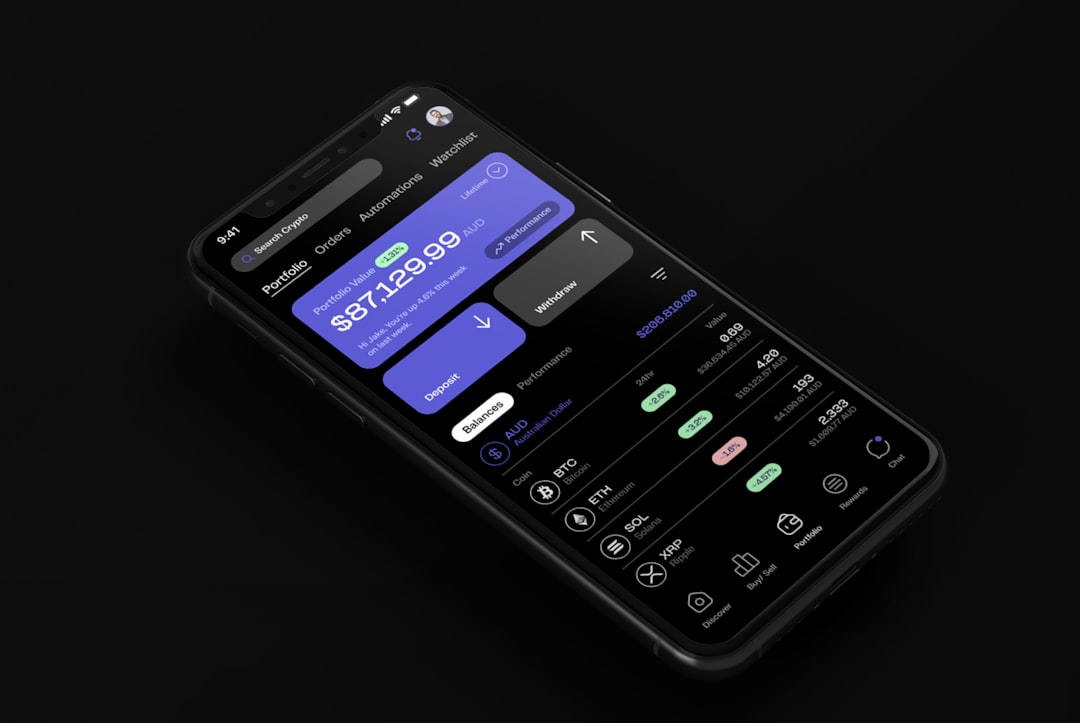
Designing Minimalist Dark Mode Interfaces for Modern Mobile Apps
The Rise of the Dark Aesthetic
In the evolving landscape of mobile UI/UX design, dark mode has transitioned from a niche feature for power users to a standard expectation. For designers at TechAlb, the challenge is not just to invert colors, but to craft an experience that feels intentional, sophisticated, and accessible. Minimalist dark mode design is about more than just aesthetics; it is about cognitive load reduction, battery efficiency, and providing a premium feel to the digital experience.
Minimalism in dark mode is an exercise in restraint. When you remove the crutch of white space, you must rely on typography, depth, and subtle color palettes to guide the user. This guide explores the principles of designing minimalist dark mode interfaces that resonate with modern users.
The Science of Perception: Why Dark Mode Matters
Dark mode is not merely a stylistic choice. It addresses physiological needs. Bright, light-themed screens can cause digital eye strain, especially in low-light environments. By utilizing a dark canvas, we reduce the amount of blue light emitted by the screen, which can improve user comfort during extended sessions. However, a poorly executed dark mode—one with high-contrast neon colors on a pitch-black background—can actually cause 'halation,' where light text appears to bleed into the dark background, making it harder to read.
Defining the Minimalist Palette
Minimalism thrives on a restricted color palette. In dark mode, avoid using pure black (#000000). Instead, opt for dark greys or charcoal tones. This small shift makes the interface feel more natural and reduces the harsh contrast against text. A truly minimalist approach uses a monochromatic base with one or two accent colors reserved strictly for interactive elements like primary buttons or notifications.
Consider the following CSS approach for defining your color tokens:
:root {
  --bg-primary: #121212;
  --bg-secondary: #1E1E1E;
  --text-primary: #E0E0E0;
  --text-secondary: #A0A0A0;
  --accent: #BB86FC;
}
Hierarchy Through Depth, Not Brightness
In a light interface, we use shadows to denote elevation. In a dark interface, shadows are often invisible. To maintain hierarchy, modern minimalist design uses 'surface elevation'—the practice of changing the shade of the background color to indicate depth. The higher an element is in the UI hierarchy, the lighter its background color should be. This allows you to differentiate between cards, modals, and the main background without relying on heavy borders or drop shadows.
The Role of Typography
Typography is the heartbeat of a minimalist interface. When the visual noise is stripped away, the user focuses entirely on the content. In dark mode, font weight becomes crucial. Light text on a dark background can appear bolder than it is. To compensate, designers should often use slightly thinner font weights or ensure that the kerning is optimized to prevent characters from blurring together.
Best Practices for Minimalist Dark Mode
- Avoid Pure Black: Use deep greys to reduce eye strain and provide a softer, more premium look.
- Limit Your Palette: Stick to a 60-30-10 rule. 60 percent primary dark background, 30 percent secondary surface color, and 10 percent accent color.
- Prioritize Accessibility: Always test for contrast ratios. Even in dark mode, text must meet WCAG standards for legibility.
- Reduce Motion: Minimalist interfaces benefit from subtle, purposeful transitions. Avoid jarring animations that clash with the calm nature of a dark theme.
- Consistent Iconography: Use outline icons rather than filled icons in dark mode to maintain a lightweight, airy aesthetic.
The Technical Implementation: A Proactive Approach
Implementing dark mode requires a robust design system. By using CSS variables or design tokens, you ensure that your design remains consistent across the entire application. When you change a single token, the entire UI updates, preventing the 'patchwork' look that often occurs when manual color adjustments are made.
For developers, implementing this in a React Native or Flutter environment is straightforward if you structure your theme object correctly. Here is an example of how to structure a theme provider for a minimalist application:
const darkTheme = {
  colors: {
    background: '#121212',
    surface: '#1E1E1E',
    primaryText: '#F5F5F5',
    secondaryText: '#B3B3B3',
    accent: '#03DAC6',
  },
  spacing: {
    xs: 4,
    sm: 8,
    md: 16,
  }
};

export default darkTheme;
Common Pitfalls to Avoid
One of the biggest mistakes in dark mode design is 'over-designing.' Designers often try to compensate for the darkness by adding vibrant gradients or complex illustrations. Minimalism demands that you resist this urge. Keep the interface clean. If an element does not serve a clear functional purpose, remove it. The goal is to provide a serene, distraction-free environment that lets the content shine.
Another pitfall is ignoring the 'System Preference' setting. Modern mobile operating systems allow users to toggle dark mode globally. Your app should respect this setting by default. Forcing your own dark mode regardless of the user's system settings is a violation of user autonomy and can lead to a disjointed user experience.
Conclusion: The Future of Dark UI
Designing for dark mode is a journey toward clarity. By embracing minimalist principles—restricting your palette, focusing on typography, and using surface elevation for depth—you can create mobile applications that are not only beautiful but also deeply functional. As we move forward, the best apps will be those that feel like a natural extension of the hardware, providing a seamless, comfortable, and elegant experience for every user.
At TechAlb, we believe that the best interfaces are the ones you do not notice—they simply work. Dark mode is a powerful tool in that endeavor. Use it wisely, test it thoroughly, and always keep the user's comfort at the forefront of your design decisions.
Key Takeaways
- Depth is Key: Use color intensity to signify elevation instead of shadows.
- Typography Matters: Adjust font weights to ensure readability on dark backgrounds.
- Accessibility First: Never sacrifice contrast for aesthetics; ensure your text is legible for all users.
- System Integration: Always respect the user's system-wide dark mode settings.
- Less is More: Use minimalist principles to remove visual clutter and highlight core functionality.